Connect with us

Hi, what are you looking for?

TopMarketReports.comTopMarketReports.com

Tech News

Hopefully, this new PARAMOUNT logo won’t stick around for long

The Paramount logo, redesigned for an investor presentation.
This probably isn’t Paramount’s new logo. | Image: Paramount

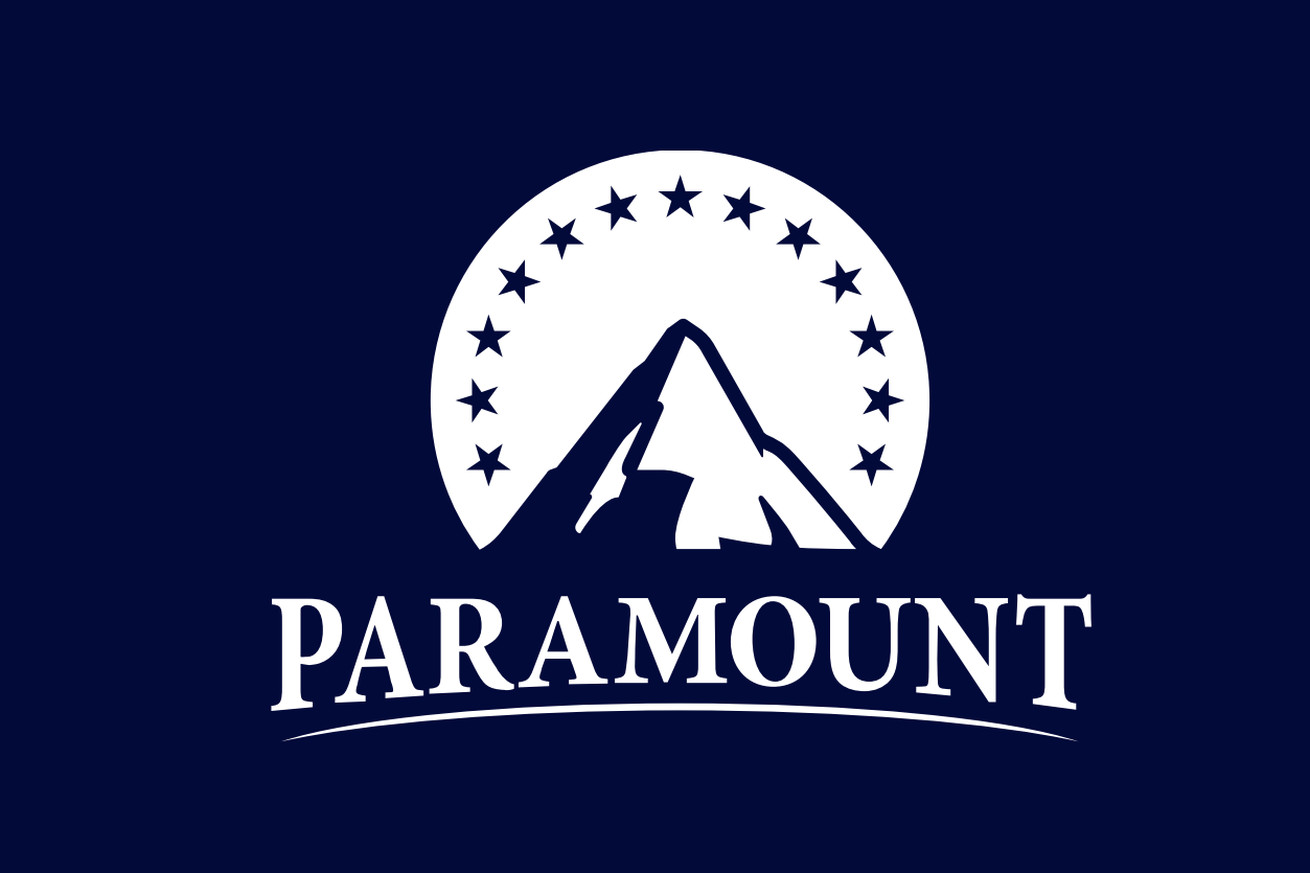
If you didn’t know Paramount Global is set to merge with Skydance, then the logo included in their recent investor presentation would like to share an important update. Under its traditional mountain and stars, it shouts PARAMOUNT, using the all-caps styling and arched text of the Skydance logo instead of a more gently whispered Paramount.

It’s… not good. But, like the very bad Warner Bros. Discovery logo that appeared in 2021 when their merger was announced but disappeared by the time the deal closed a year later, it’s unlikely this is the final version of whatever redesign Paramount might cook up. If and when the deal gets done, the logo at that time probably won’t look like some poor shmoe had to jam out a quick synergistic symbol…

Continue reading…

You May Also Like

Editor's Pick

In this edition of StockCharts TV‘s The Final Bar, Dave shows how breadth conditions have evolved so far in August, highlights the renewed strength in the...

Editor's Pick

In this StockCharts TV video, Mary Ellen examines which areas of the market have moved into favor amid the S&P 500 pullback. She compares value...

Tech News

Apple’s UWB trackers remain a cheap, convenient way to keep tabs on all your belongings. | Photo: Vjeran Pavic / The Verge Over the...

Tech News

You can save $60 on a few Kindle Scribe bundles at the moment. When it comes to finding a device to read ebooks, you...